type specimen book
Univers
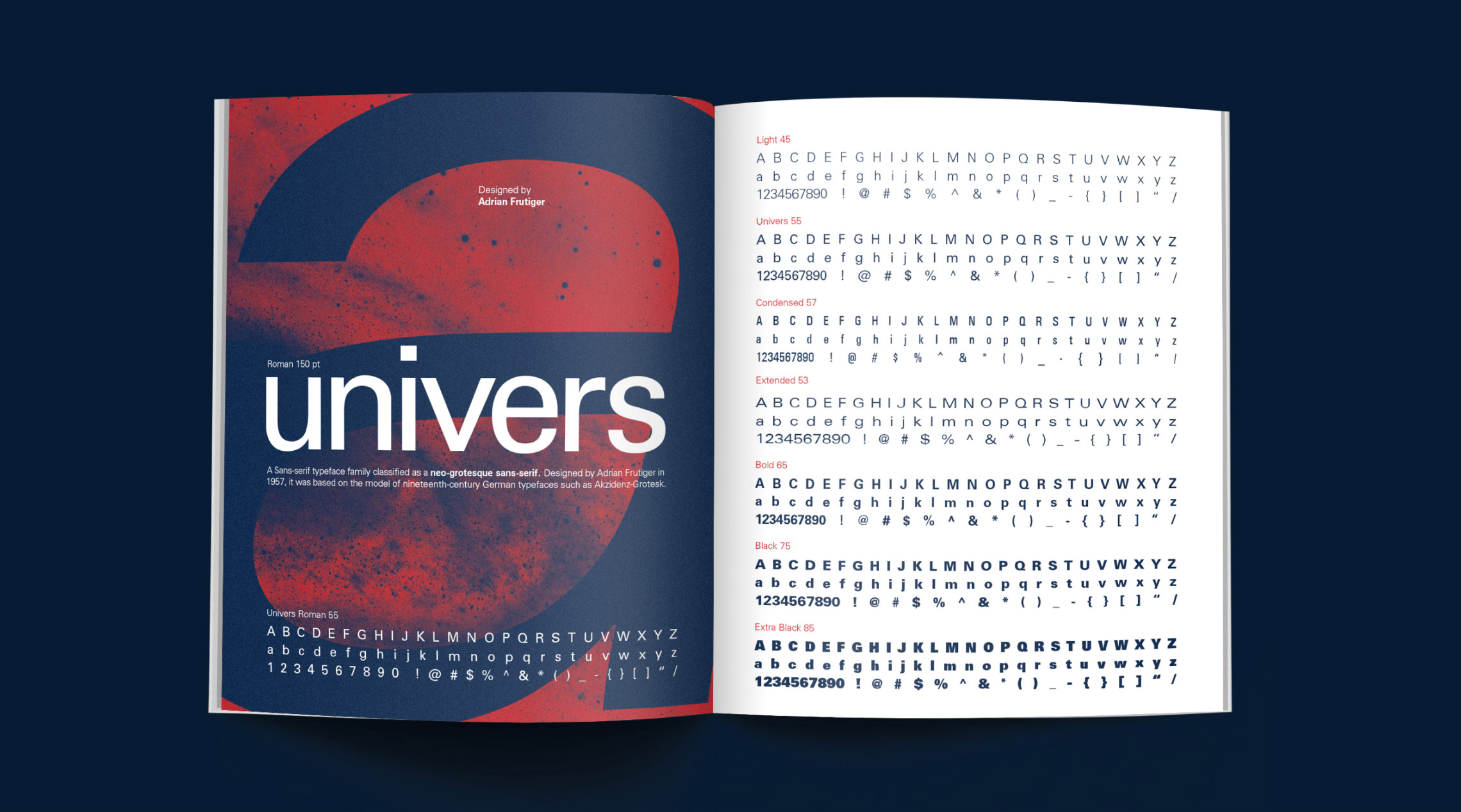
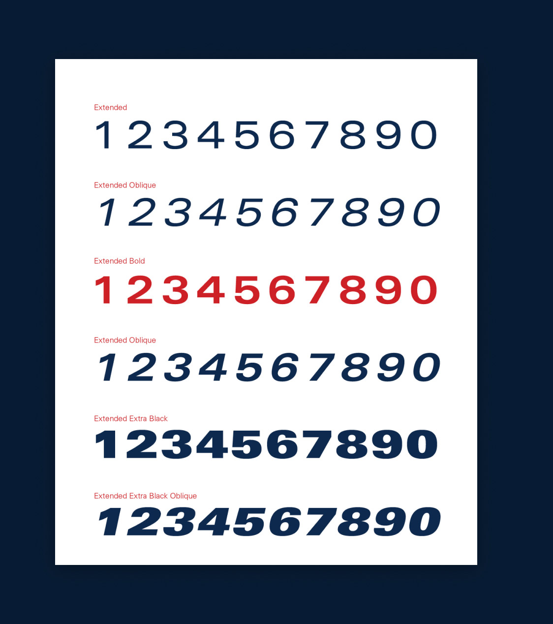
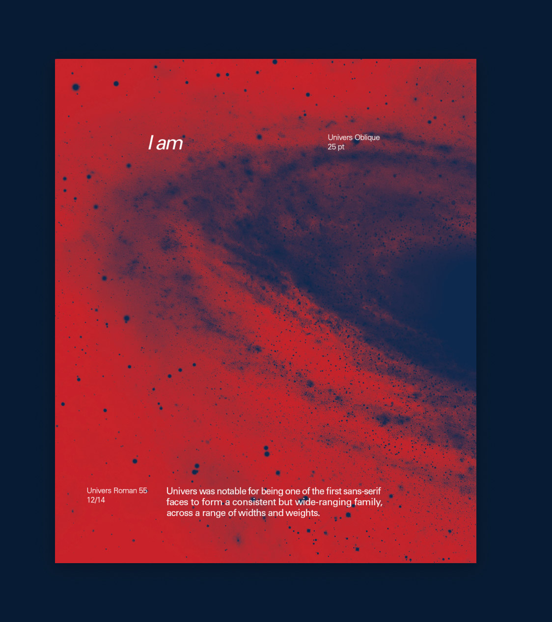
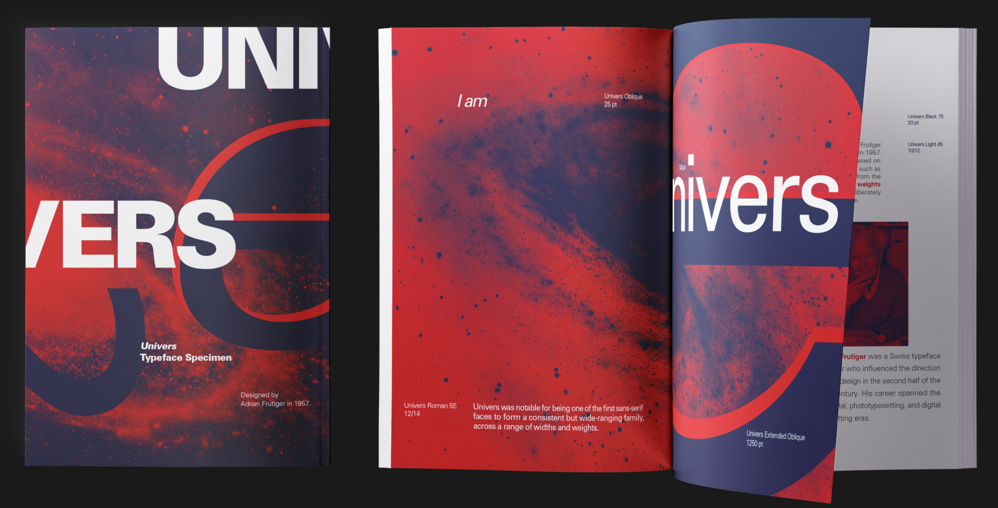
Univers is a large sans-serif typeface family designed by Adrian Frutiger in 1957. The type specimen book aims to sell Univers as a timeless and versatile sans-serif typeface, showcasing the wide range of weights and arrangements that can be created using this comprehensive typeface family.
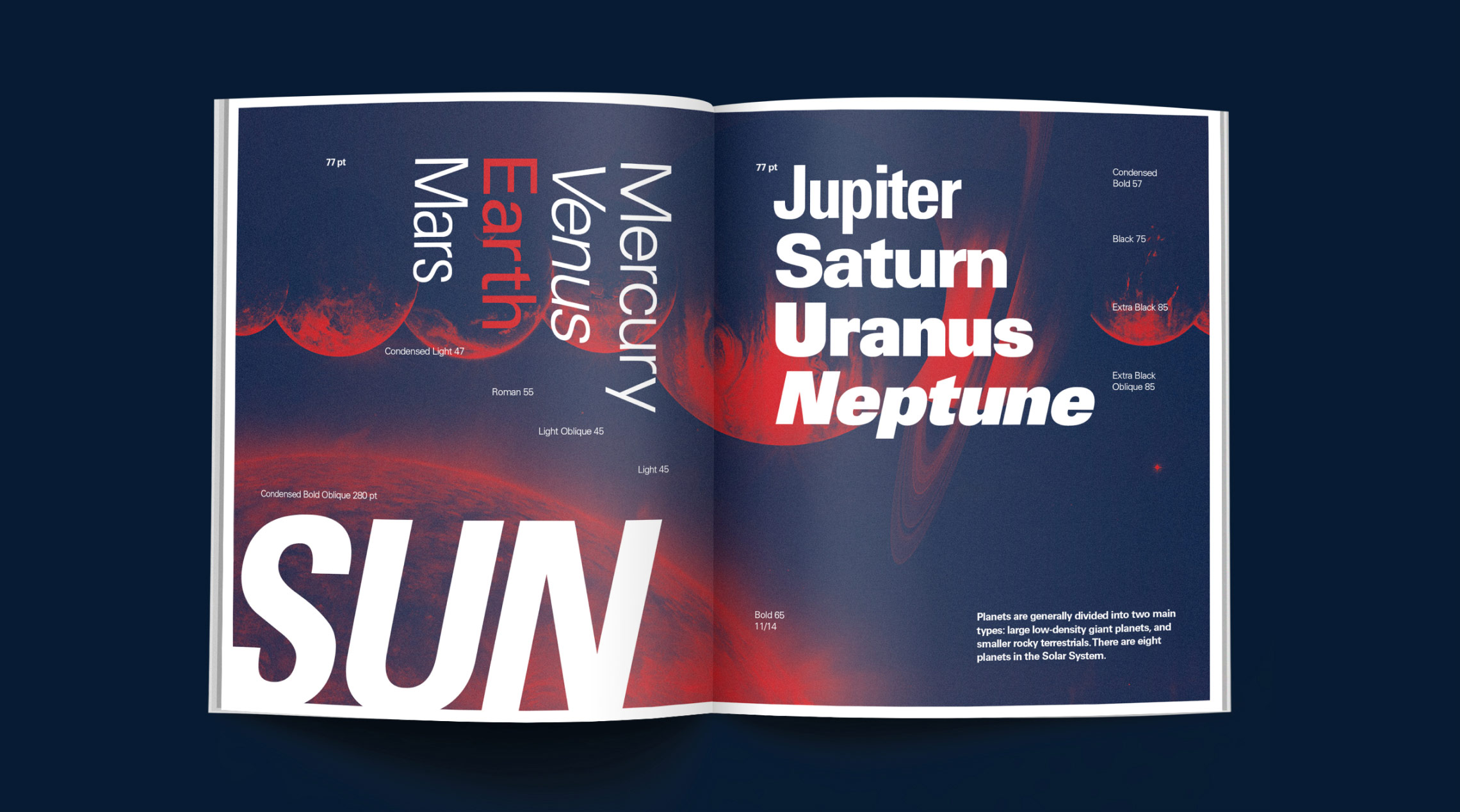
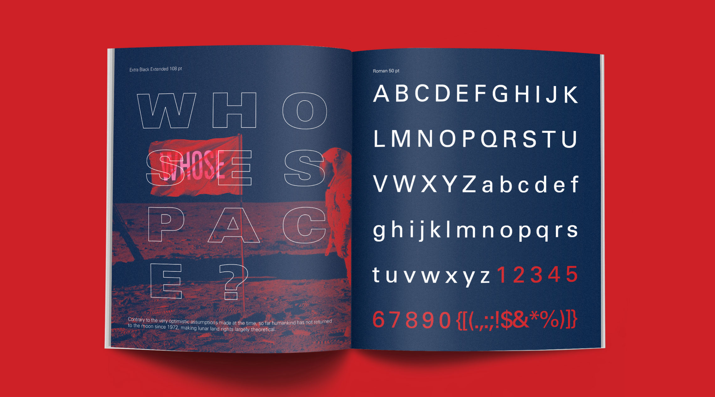
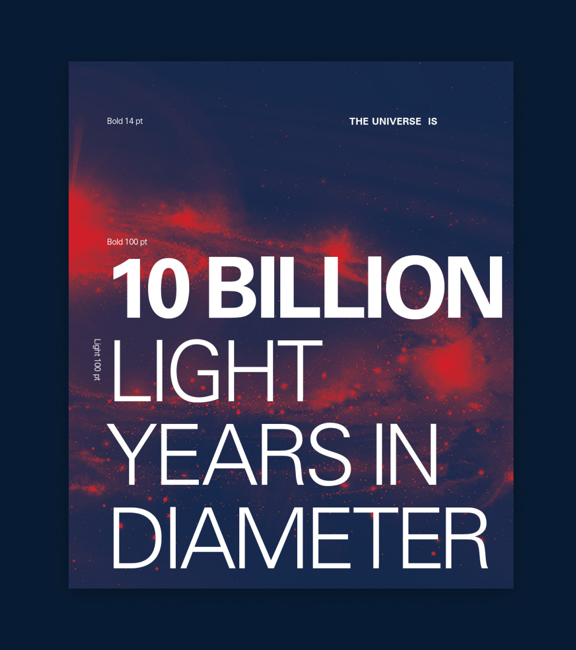
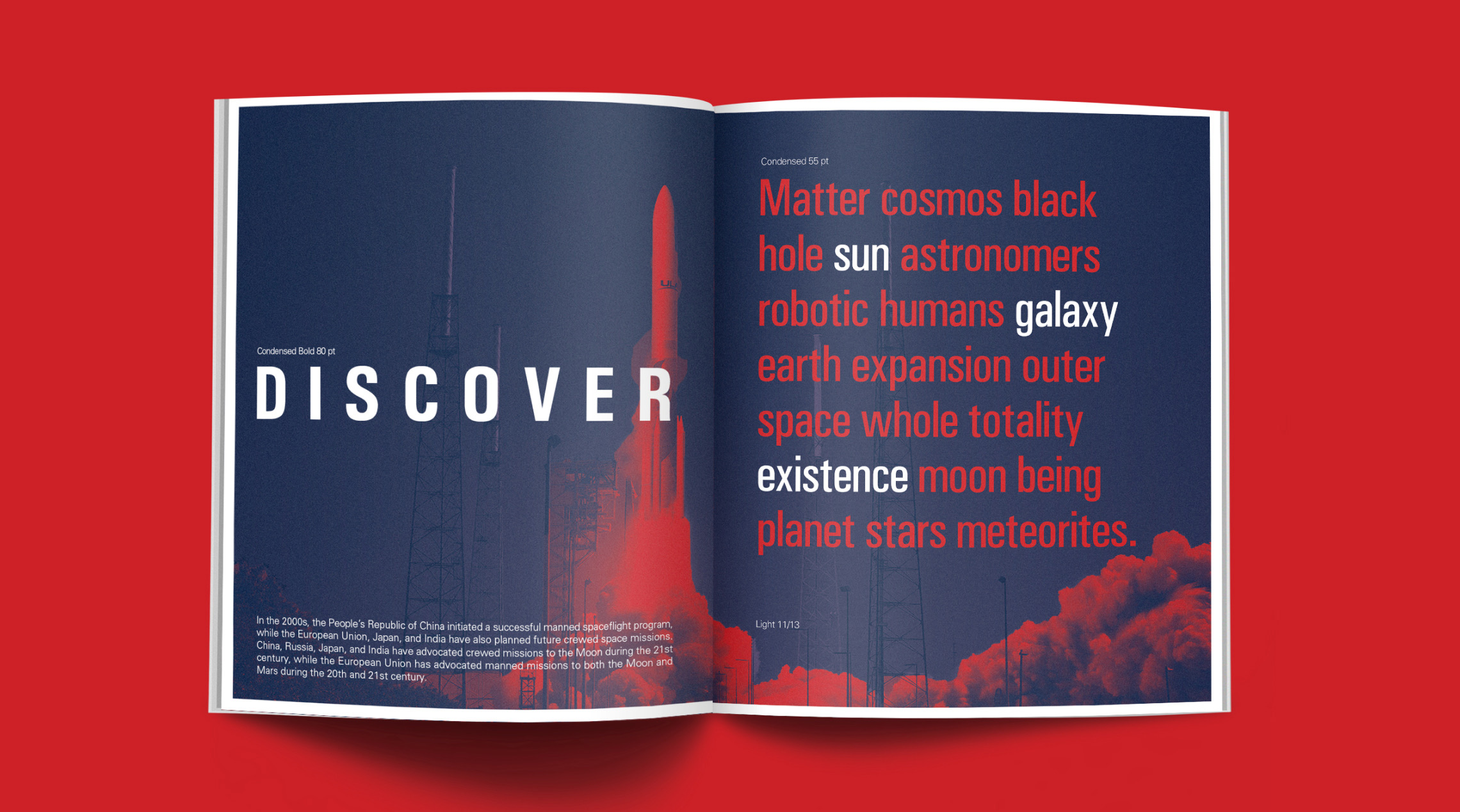
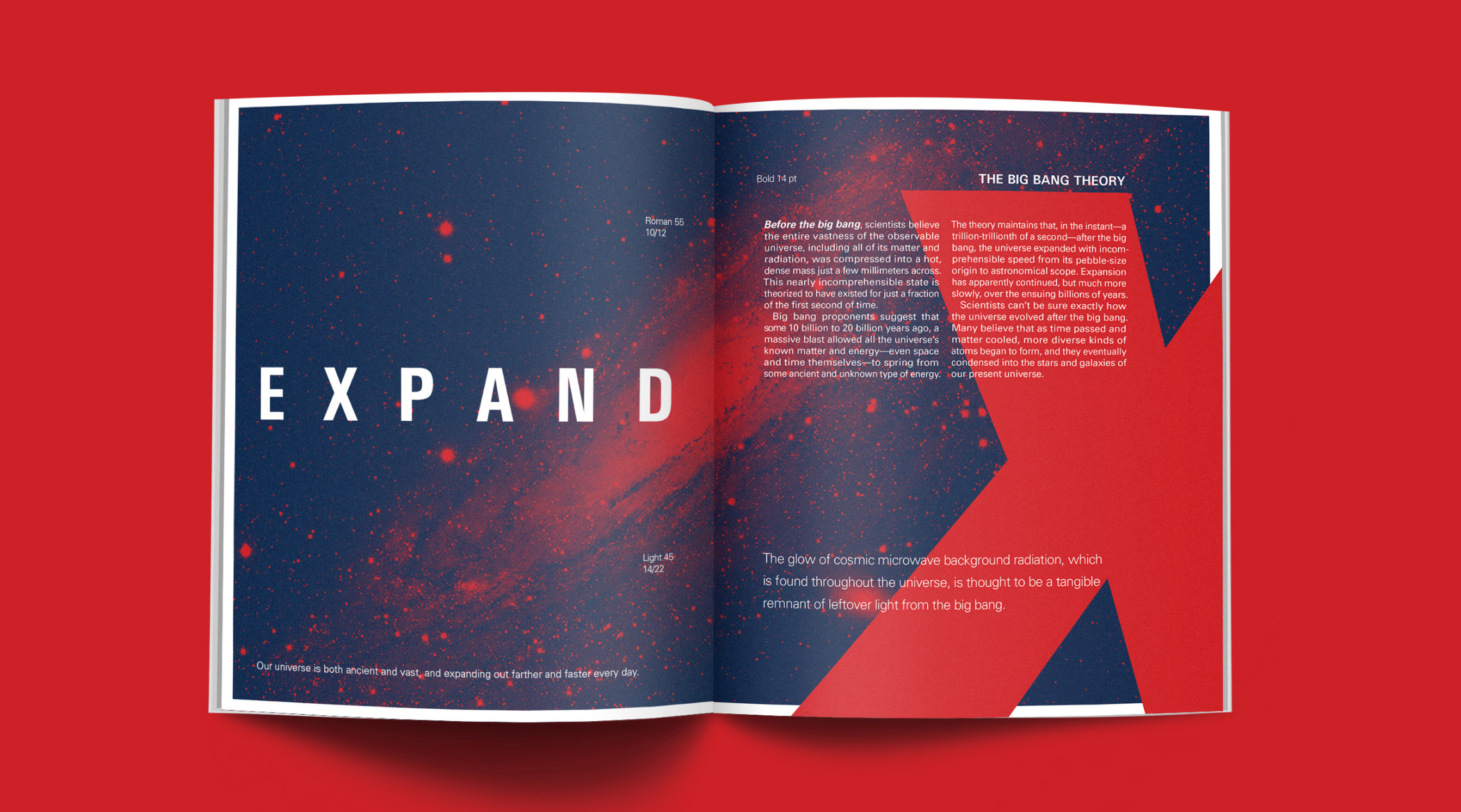
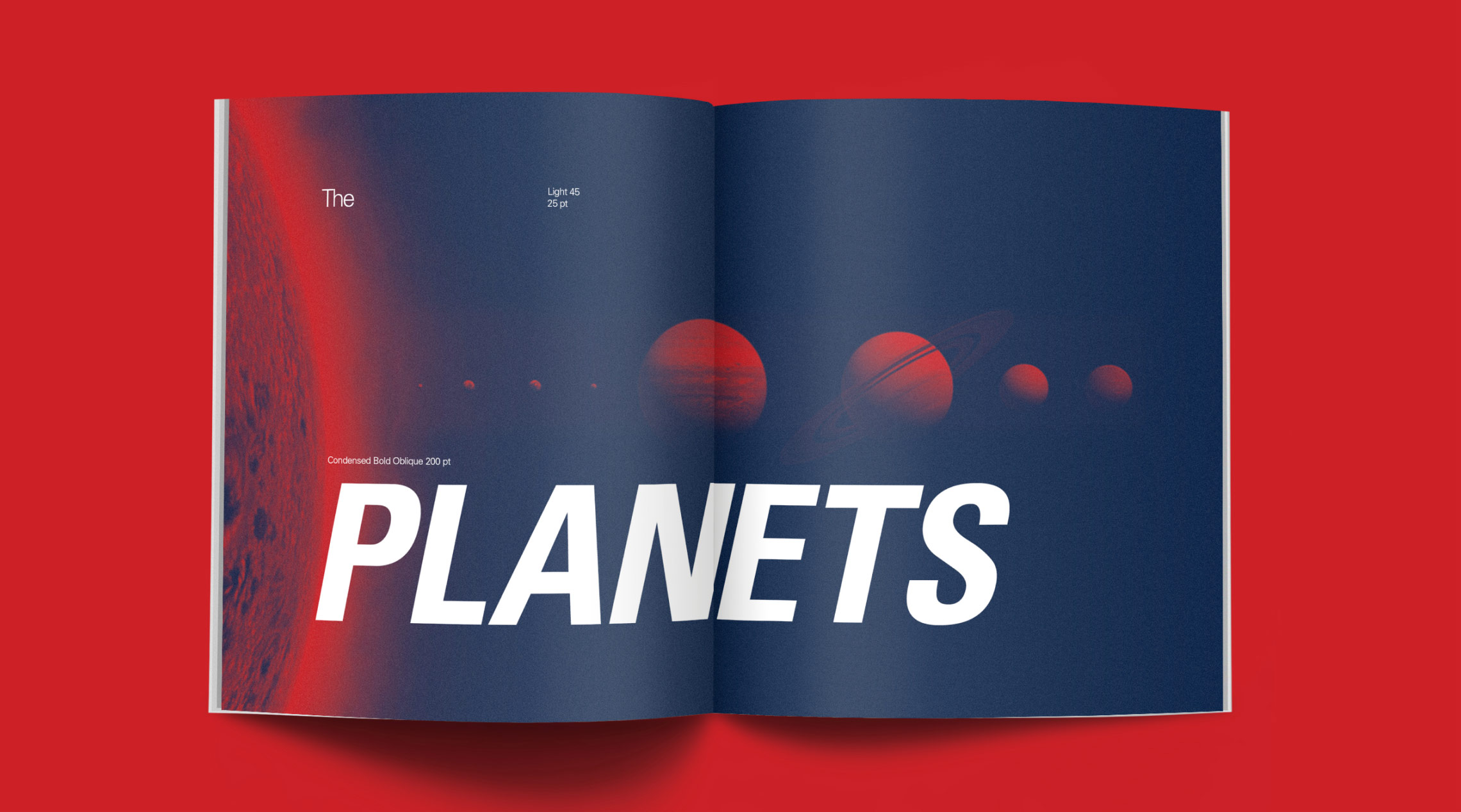
The goal was to sell the font showcasing the different arrangements you can create with various sizes and weights. Using a simple colour palette inspired by the universe and duotone imagery, the book lets the type shine and be the hero on each page.
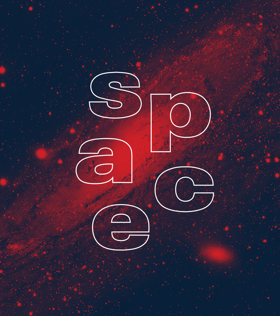
The concept plays with the typeface’s name and explores a theme revolving around the universe and our galaxy while looking at how it’s been the subject of studies and explorations in the last 70 years. A minimal colour palette was carefully chosen, where a night blue symbolizes the dark nature of the universe, paired with a bright red, representing the energy and fire in our galaxy.
While showcasing different weights and arrangements, the piece gives the potential client a solid idea of the possible treatments and layouts that can be achieved with this comprehensive, versatile typeface.
